Jesse Parris-Lamb Website Redesign (Unofficial)


I recently moved to Brooklyn and have started to spend a few hours a day at The Brooklyn Public Library near Prospect Park to get some work done. I’ve been looking for inspiration for my next project, and on my first day walking to the library in the morning, I walk past this interesting “storefront” that looked different from the rest on the street.
I did a quick look on Apple Maps and saw it was the home of Jesse Parris-Lamb: a Brooklyn based interior design firm founded in 2014 — and they do really cool work. When I got to the library, I checked out their website and thought “I can probably do better” (humbly, of course) so here we are…
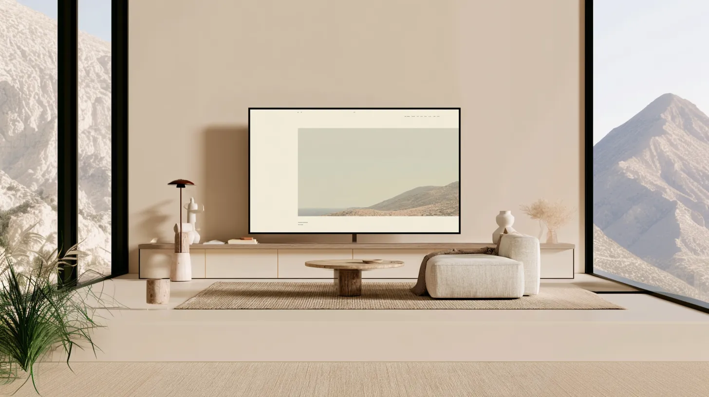
The home page..
I wanted to try and capture the essence of JPL’s design in this website. To me, they show a lot of expression, but a lot of restraint. They add a lot of character to spaces, a lot of flair… but it all seems very familiar and not overdone. That’s tough to nail. So the website reflects the same principles: charming and familiar at face value, but very unique and intentional. Everything has to have a purpose.
The goal of the home page was to get straight to the point. Get you into the world of Jesse Parris-Lamb as soon as you land on the website. I think the home page is a great execution of user guidance as well — tough to put into words, but I don’t feel overwhelmed on the home page. I have everything I would want.
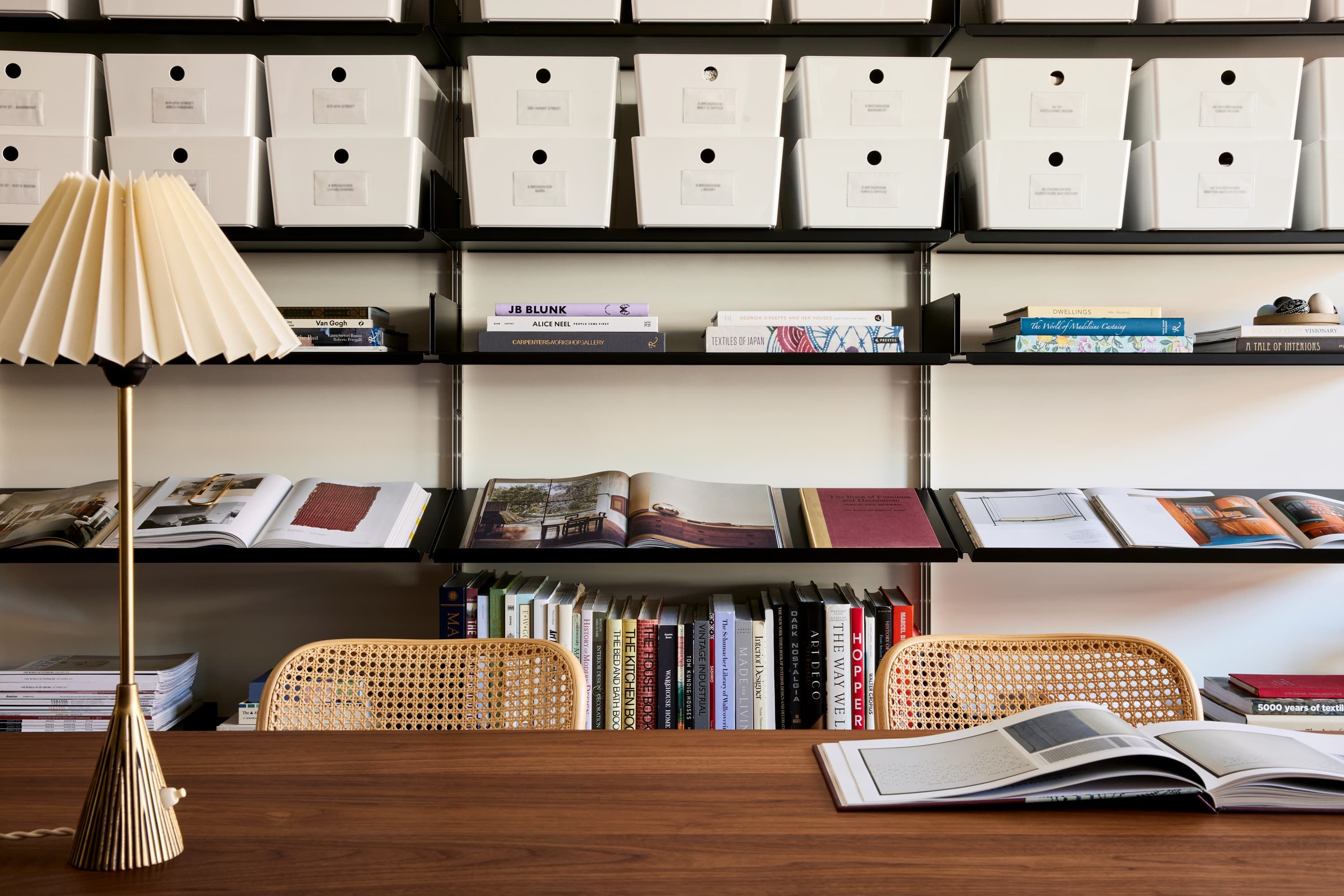
The interior gallery..
Interior gallery was an area I had to show a lot of restraint. Something bold or super “experience” heavy didn’t fit into the vibe I had assigned to this project. A few nice touches went a long way here: a subtle parallax scroll and some hover effects to give the thumbnails some life.
A space gallery..
The gallery for each space was based off of reference image I generated for inspiration. I like how the large, off-center images sort of command a lot of space and attention, yet the write up to the left seems to have the same amount of pull. Idk, it was a fun use of spacing. The film strip on the bottom is a nice touch as well, the page felt incomplete and cheap without it.
The about page..
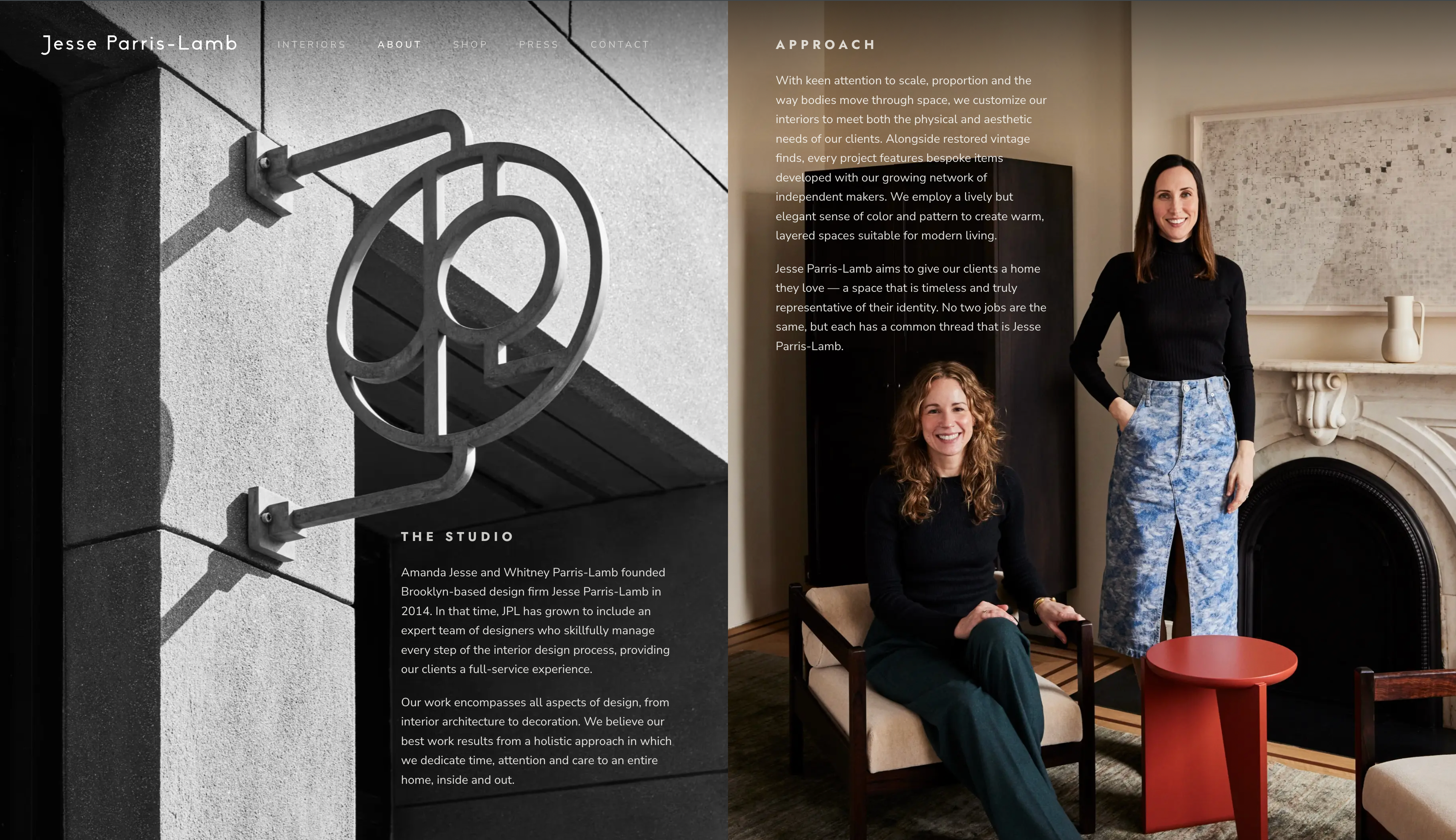
Finally, the about page — which unironically is my favorite page of the project. I kept getting stuck trying to turn the about page into a whole experience, and it just never felt right. The original about page on JPL’s site is very simple and plain, but that’s why it’s good. I came to the conclusion that the rest of the site is designed to be an experience for their work… the about page should not be competing with that. I want to see the story, and I want to see it quickly and all at once.
I pulled inspiration from a website I had in my references that made really good use of full bleed images and color contrast. The other pages I had built were pretty uniform, so I felt that the about page was fair game for a slight departure in design. It feels special, but still not overdone.
The original site..
Here is the original (current) website. It’s fine, but it doesn’t feel special. To me, it didn’t reflect the level of work that Jesse Parris-Lamb does.
A few of my references..