Berneron
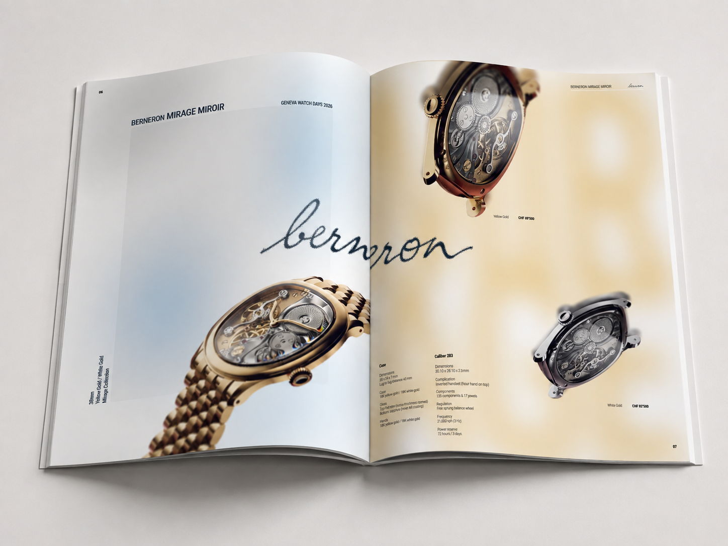
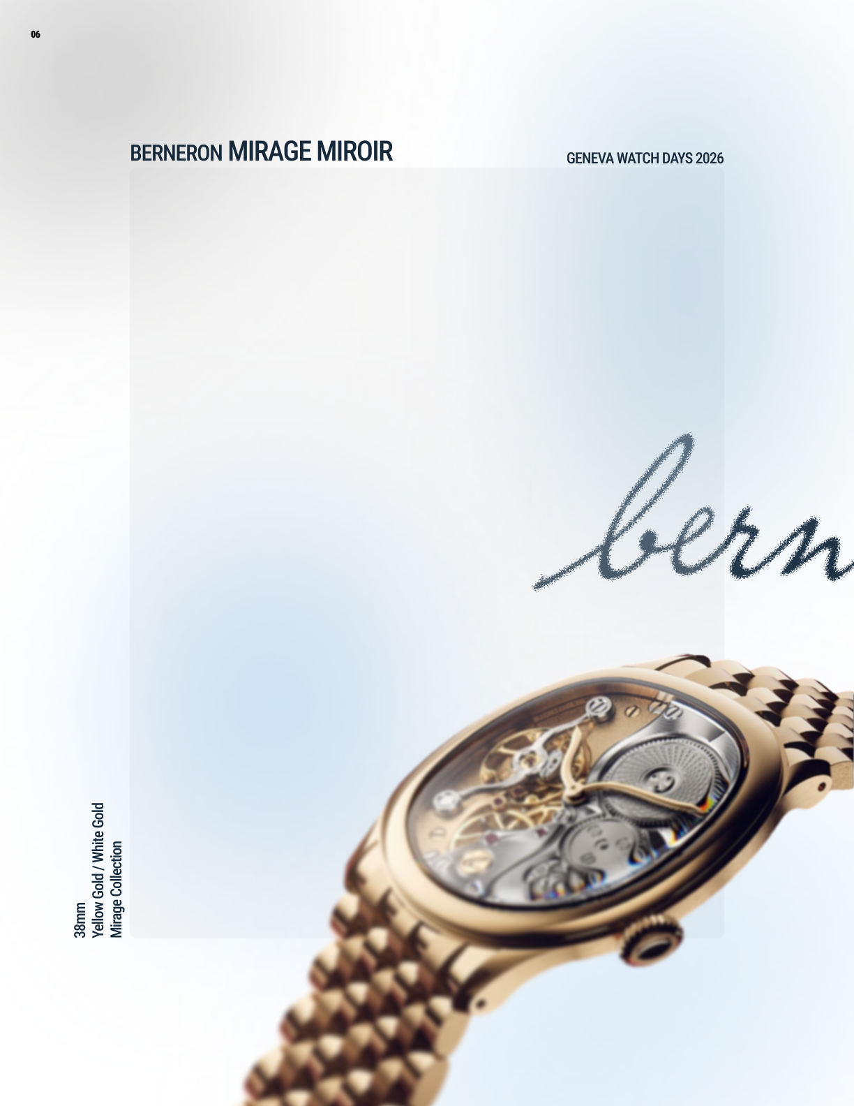
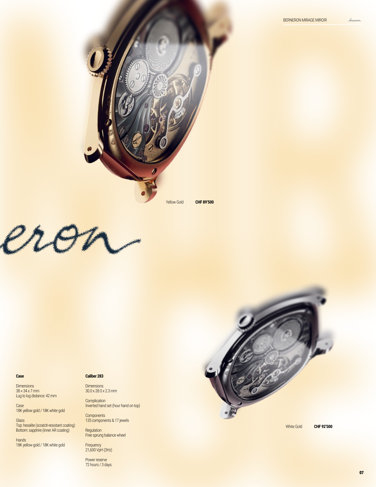
I wanted to do an editorial-style project based off one of my personal hobbies. I saw that one of my favorite watch brands, Berneron, was releasing a new version of their Mirage watch — the Mirage Miroir. Perfect subject. The idea was a full editorial spread for the launch, and the main visual concept I played with was “deception of the eyes” — obviously, because of the Mirage name.
On the left I tried to make the background look as if you'd been staring at a screen too long — those blue-ish hues that come out from visual fatigue. A weird concept I came up with randomly, but I emulated it with subtle blue diffusions, a glass-like rectangle for framing, and the 3/4 watch shot with a slight blur. The right side started with the “MIRAGE” text heavily blurred in the background — barely visible unless you squint or look from afar — then the caseback shots falling down, and the rest is pure typography. Finally the Berneron logo across both pages. Super happy with the result.